A case study of Brand Identity for an Australian Nutritionist.
Mihaela Raguz is a nutritionist and naturopath operating in Australia. She approached PearDesign seeking to get her own personal brand identity. She wanted to have a brand which will represent her current values and shape the future of the business. The design supposed to reflect both her personality and professional goals.
The Challenge
- The audience was described as very wide “I want to help people first which in turn will help business so essentially both”
- The brand identity supposed to represent soft approach and strong leading abilities at this same time.
- The graphic supposed to be simple, “we are bombarded with complexity and information, we do not trust anything or anyone anymore”(client Comment)
An additional challenge was communication. The time difference always made one of the sides be on the call after all working day, while the other was still before the working hours.
The Brief
The initial brief reviled the character of Mihaela’s business, a deeper interview gave us an idea of the style and colours for her brand. She wanted to look different than similar businesses. Against the modern trends, we’ve picked colours from pastel palette connected to the calming essence of nature.

Branding colour palette creation case study PearDesign
Ideation and Iterations
What is always a surprise to our customers – we embrace the ‘failure’ of the first proposed sketches. It’s not about our abilities neither the personal taste of the customer. The initial sketch is to open the conversation, move it to a different level. The transfer from words and mood boards to graphics requires iterations and keeping everyone updated on the process.
Below a few examples of the ideation process and design iterations 🙂
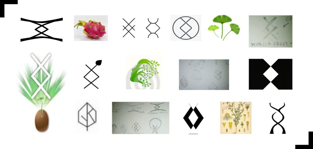
Logo exploration for Nutritionist – by PearDesign
Final logo mark
The final logo incorporates two symbols. The first is a Viking Rune INGUZ (Ingwaz, Ing, Iggus, Enguz) which stands for determination and professionalism, the meaning of the rune can be described as: “where is the will there is a way”. It reflects both – business and personal goal-oriented approach.
The second element is the germinating plant understood as a constant move towards new challenges, escaping the comfort zone, adopting new habits and using them to grow.

Logomark creation case study by PearDesign
Additional assets
The basic brand identity contains visual deliverables as a logo, patterns, social media elements, colour scheme and font faces. They are visible to the outside world.
There are also invisible elements such as brand vision and mission. Establishing these is important for the brand strategy and keeps the company on the track being a reference when decision time comes. The picture below contains an example of an Instagram post, photo frame and graphic asset.

Proposed use of brand elements by PearDesign
Things to Remember
- Trust the process! – follow it till the end
- Be brave, there are no ‘good’ or ‘bad’ ideas
- Be prepared – do your research and consultations
- Communication is key – mutual understanding of needs and goals is important
Thank you for reading!
